Shadow not rendered when using Gradient

Hi,

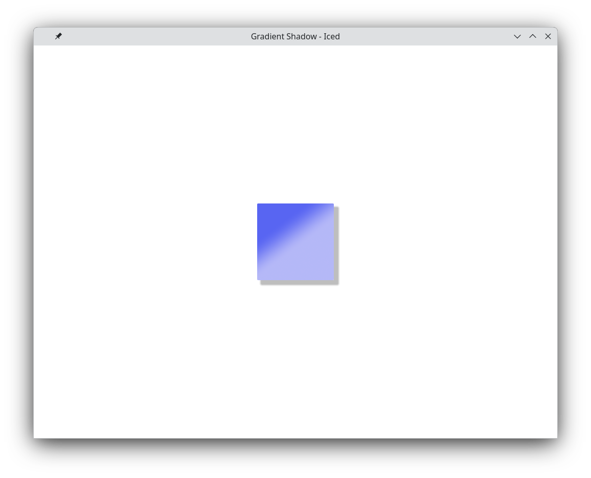
I’ve noticed if I use a gradient background for a button it will not render a shadow.

For example:

use iced::{
    Background, Element, Gradient, Length, Shadow, Theme,
    gradient::Linear,
    widget::{button, container},
};

#[derive(Default)]
struct AppState {
    gradient: bool,
}

#[derive(Clone)]
enum Msg {
    Toggle,
}

fn main() -> iced::Result {
    iced::application(
        AppState::default,
        |app: &mut AppState, msg: Msg| match msg {
            Msg::Toggle => {
                app.gradient = !app.gradient;
            }
        },
        view,
    )
    .run()
}

fn view(app: &AppState) -> Element<'_, Msg> {
    let button = button("")
        .style(|theme: &Theme, status| {
            let palette = theme.extended_palette();
            let mut style = if app.gradient {
                gradient_style(theme, status)
            } else {
                button::primary(theme, status)
            };

            style.shadow = Shadow {
                color: palette.secondary.strong.color,
                offset: [8.0, 8.0].into(),
                blur_radius: 1.0,
            };
            style
        })
        .width(150)
        .height(150)
        .on_press(Msg::Toggle);

    container(button).center(Length::Fill).into()
}

fn gradient_style(theme: &Theme, status: button::Status) -> button::Style {
    let palette = theme.extended_palette();
    let primary = palette.primary.base.color;
    let secondary = palette.primary.weak.color;

    let background = Background::Gradient(Gradient::Linear(
        Linear::new(2.5)
            .add_stop(0.1, primary)
            .add_stop(0.6, secondary),
    ));

    button::primary(theme, status).with_background(background)
}

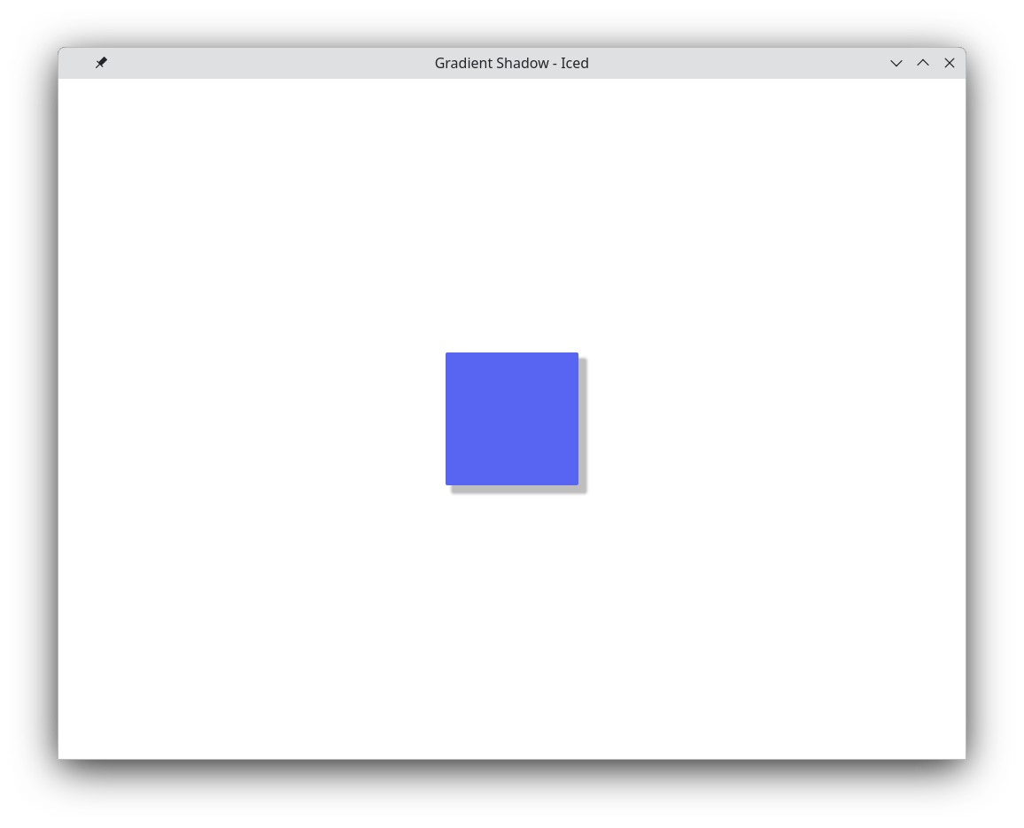
If you toggle the style between the button::primary and gradient_style you’ll see the shadow works when the background is not a gradient.

It’s a limitation of the WGPU renderer. You could try using a Stack with a container that has a shadow underneath.

Hi,

Thanks that does work. Updated using stack.

use iced::{
    Background, Color, Element, Gradient, Length, Shadow, Theme,
    gradient::Linear,
    widget::{self, button, container},
};

#[derive(Default)]
struct AppState {
    gradient: bool,
}

#[derive(Clone, Copy)]
enum Msg {
    Toggle,
}

fn main() -> iced::Result {
    iced::application(
        AppState::default,
        |app: &mut AppState, msg: Msg| match msg {
            Msg::Toggle => {
                app.gradient = !app.gradient;
            }
        },
        view,
    )
    .run()
}

fn view(app: &AppState) -> Element<'_, Msg> {
    // The "real button"
    let button = widget::button("")
        .style(|theme: &Theme, status| {
            if app.gradient {
                gradient_style(theme, status)
            } else {
                button::primary(theme, status)
            }
        })
        .width(150)
        .height(150)
        .on_press(Msg::Toggle);

    // A hidden button with no gradient, and opaque to support a shadow only.
    let hidden_button = widget::button("")
        .style(|theme: &Theme, status| {
            let palette = theme.extended_palette();
            let mut style = button::primary(theme, status).with_background(Color {
                a: 0.0,
                ..Color::WHITE
            });
            style.shadow = Shadow {
                color: palette.secondary.strong.color,
                offset: [8.0, 8.0].into(),
                blur_radius: 5.0,
            };
            style
        })
        .width(150)
        .height(150);

    let stack = widget::stack([widget::opaque(hidden_button), button.into()]);

    container(stack).center(Length::Fill).into()
}

fn gradient_style(theme: &Theme, status: button::Status) -> button::Style {
    let palette = theme.extended_palette();
    let primary = palette.primary.base.color;
    let secondary = palette.primary.weak.color;

    let background = Background::Gradient(Gradient::Linear(
        Linear::new(2.5)
            .add_stop(0.1, primary)
            .add_stop(0.6, secondary),
    ))
    .scale_alpha(match status {
        button::Status::Active => 1.0,
        _ => 0.8,
    });

    button::primary(theme, status).with_background(background)
}